Making Data Charts on Google Spreadsheet
I'm becoming a data junkie. I routinely look at statistical patterns in my grade book to look for trends in learning. For starters, many averages on formative assessments are up. Does that mean I'm too easy a grader? Or perhaps the assessments have gotten easier. Or maybe, even, "gulp" my students are improving their student skills of reviewing and preparation.
I'm transferring the data over to a spreadsheet on Google spreadsheet and am starting to crunch the numbers so thought I'd share the process. I've used google spreadsheets a few times this year, most notable when teaching evolution, but it was me entering data and the students looking on. We recently had a project on amphibians wherein the project venue would be student blogs and students practiced using a google spreadsheet to generate a data chart which they could embed on their blogs. It was surprisingly simple.
Step 1:
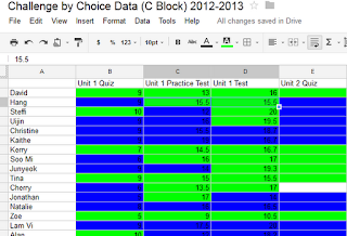
Enter your data like so:
Step 2:
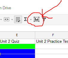
Select your cells and select the bar chart icon on the toolbar:
Step 3:
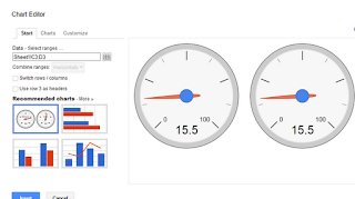
Select the type of graph you want. It will offer options depending on the type of data you want collated.
Step 4:
Once it's selected, it will automatically generate a graph. Click on the title to rename it or the "keys" on the sidebar. To publish it, make sure it's public. After clicking on the graph, you'll notice a little drop down arrow. Select "publish chart"
Step 5:
Select image (I've never used interactive charts) and copy the HTML code and paste it into the HTML version of your blog or website. When going back to visual and publishing, it looks like this:


Comments
Post a Comment